Good Food | UX Project
04 | Differentiation Plan
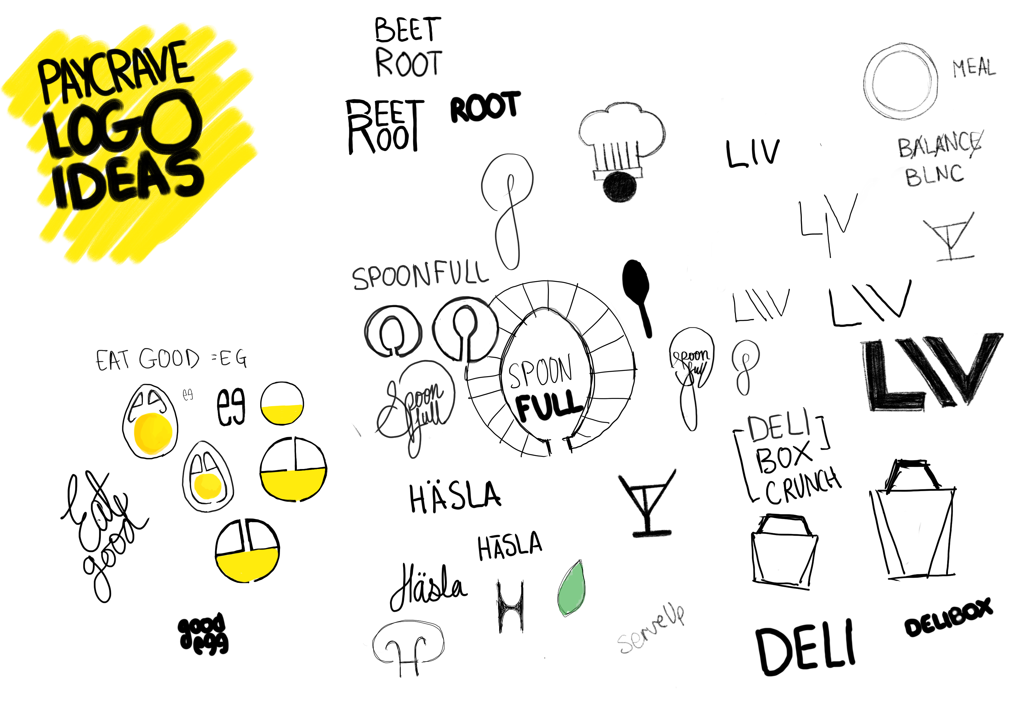
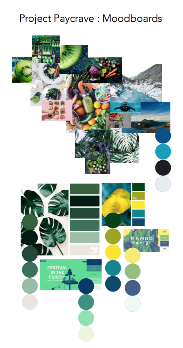
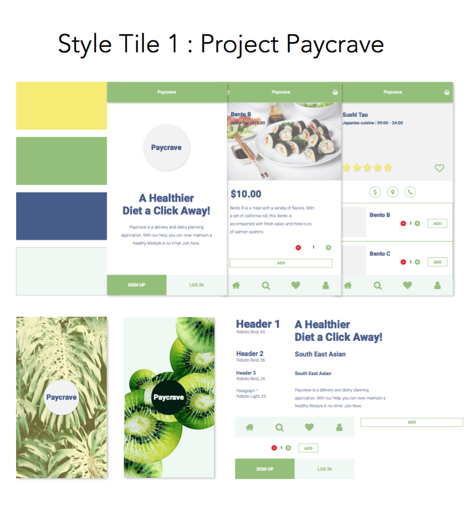
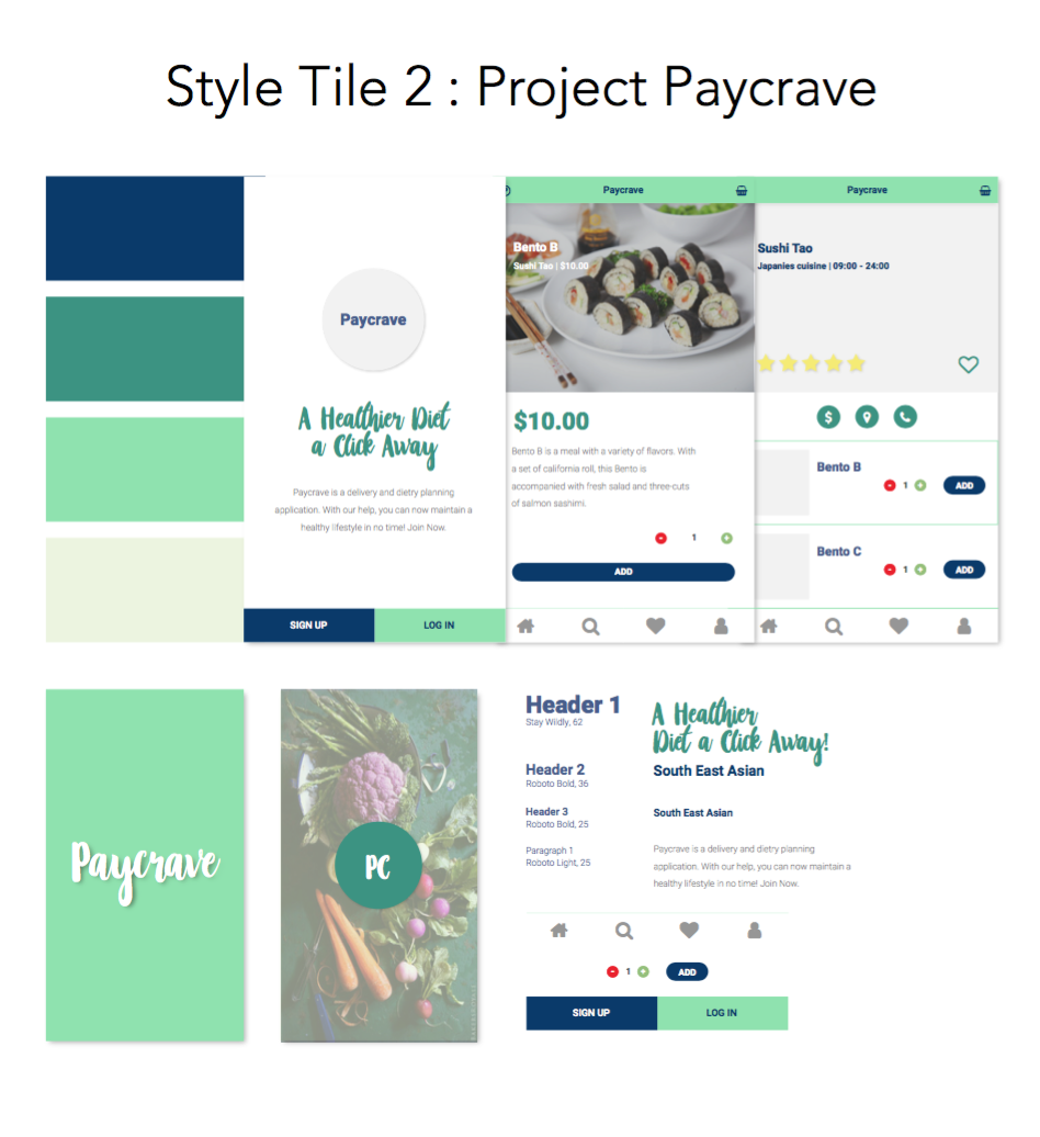
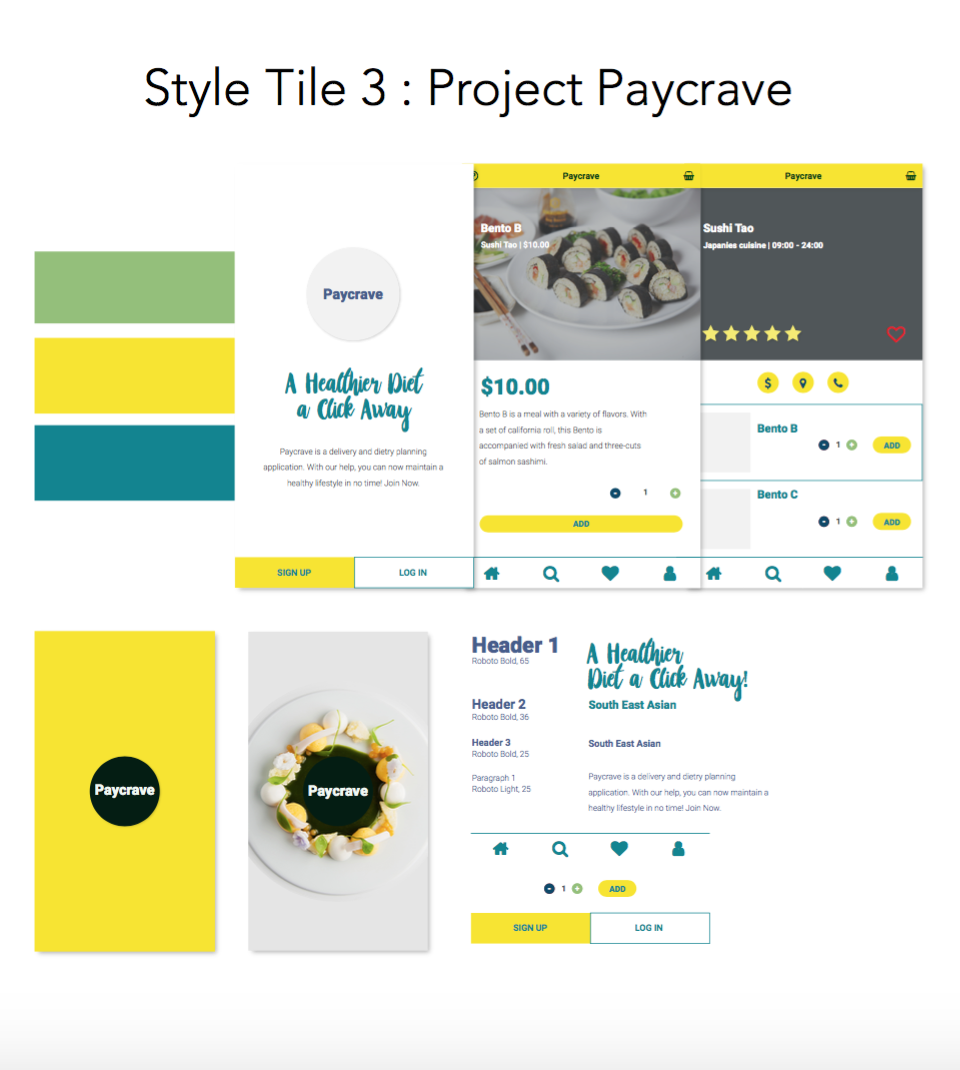
Despite the varying characters or personas, they are all identical in terms of their goal or demand. They all want to achieve or simply have access to a platform that can help them maintain a healthier diet. This single similarity, brings the idea of the application differentiation plan. First, the application aims to achieve differentiation in terms of successfully carrying the concept in a mobile application (since most competitors are only available via desktop.), in order to achieve optimum accessibility for all types of potential users. Second, the application will include a key feature that is the meal-planning and scheduled delivery feature. The third plan notices the visual aspect of the application. The Good Food aims differentiation through disregarding the conventional green-packed color scheme. Instead, whilst still keeping the fresh and bright tone, its color scheme will revolve around yellow.